UI, UX
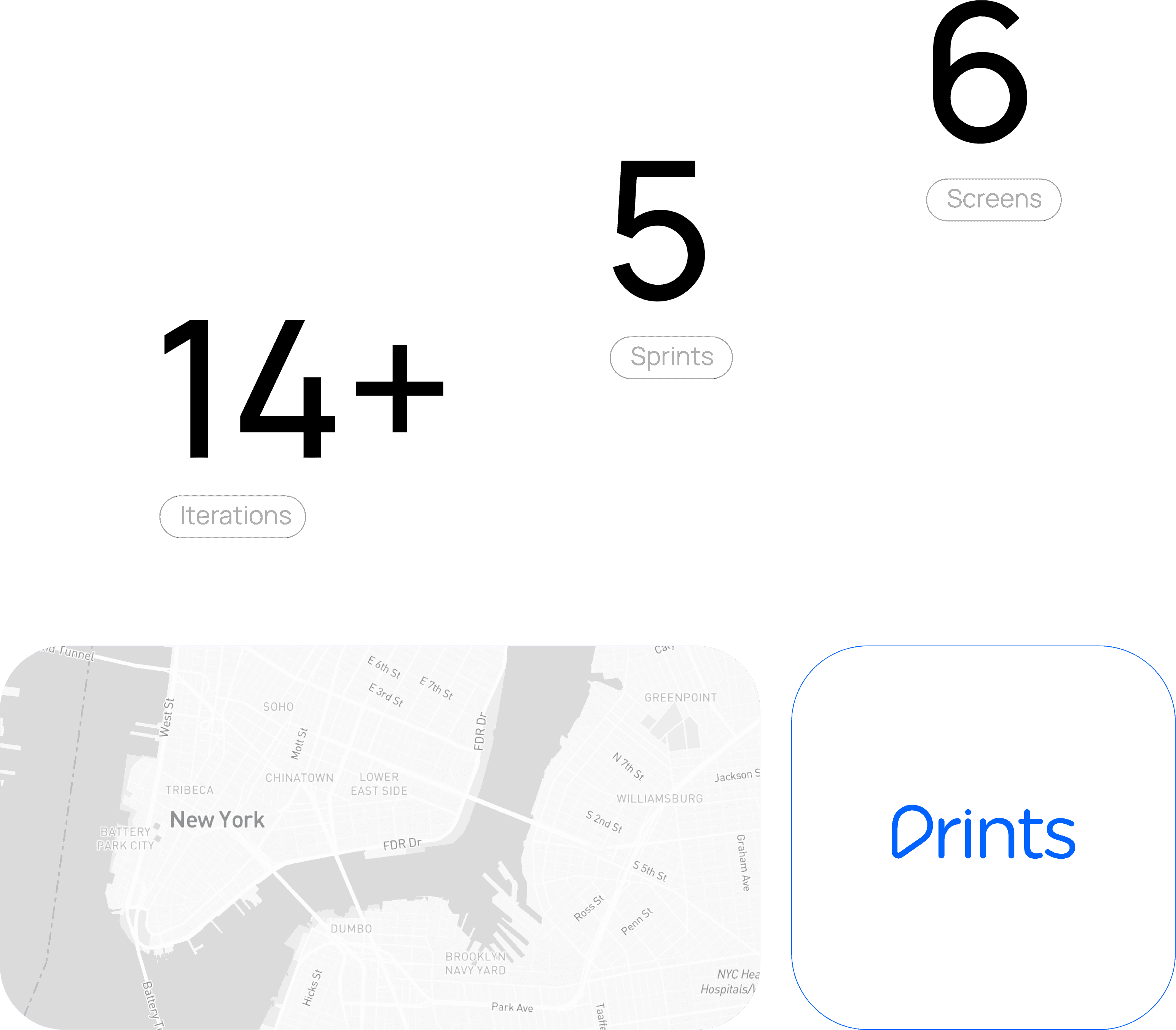
Prints
This project was a collaborative effort involving UI/UX designer, developers, stakeholders, and marketers. A marketer tool configured with OOH assets/Points of Interest, it offers insights: estimated audience, dwell time, distance, aiding asset allocation for campaigns.
Year :
2023
category :
UI / UX Design
Project Duration :
30 days

Problem :
In my role as a UI/UX Designer, I focused on creating a single-page solution that delivered all essential insights in a clear, concise format. The goal was to achieve maximum functionality with minimal complexity, ensuring a clean, intuitive, and data-focused user experience rooted in strategic minimalism.
solution :
By conducting an in-depth analysis of competitor analytics tools and user experience patterns, I structured the insights framework to enhance overall performance and usability. This process helped identify effective ways to engage diverse user groups while defining a distinct, minimal dashboard experience that balanced clarity, functionality, and visual simplicity.
This project was a collaborative effort involving UI/UX designers, developers, stakeholders, and marketers. Designed as a marketing intelligence tool integrated with OOH assets and Points of Interest (POI), it delivers key insights such as estimated audience, dwell time, and proximity, enabling marketers to make data-driven decisions and optimize asset allocation for campaign effectiveness.
Development & Design cycles
The print development and design process follows an iterative approach, focusing on continuous refinement to create visually engaging, high-impact materials that effectively communicate the brand’s message and maintain design consistency across all touchpoints.
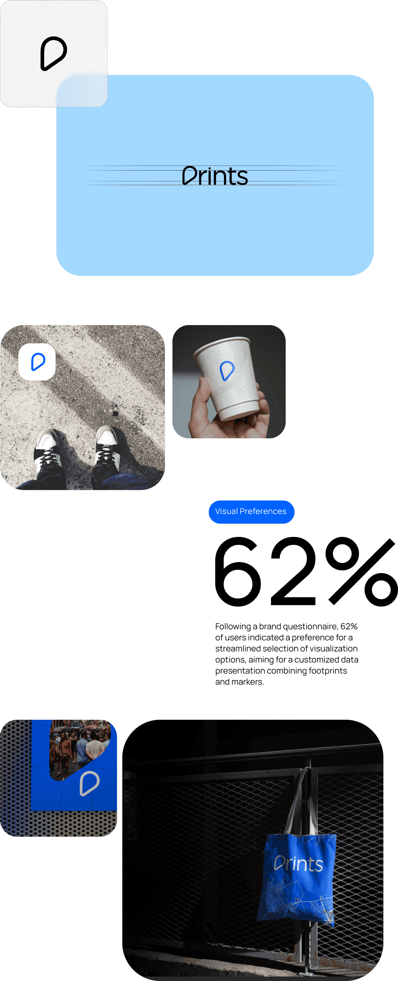
An interesting aspect of the Prints branding journey is that its logo went through 10 design iterations before finalization — a testament to the meticulous attention to detail and dedication invested in creating a visually striking, balanced, and memorable brand identity.
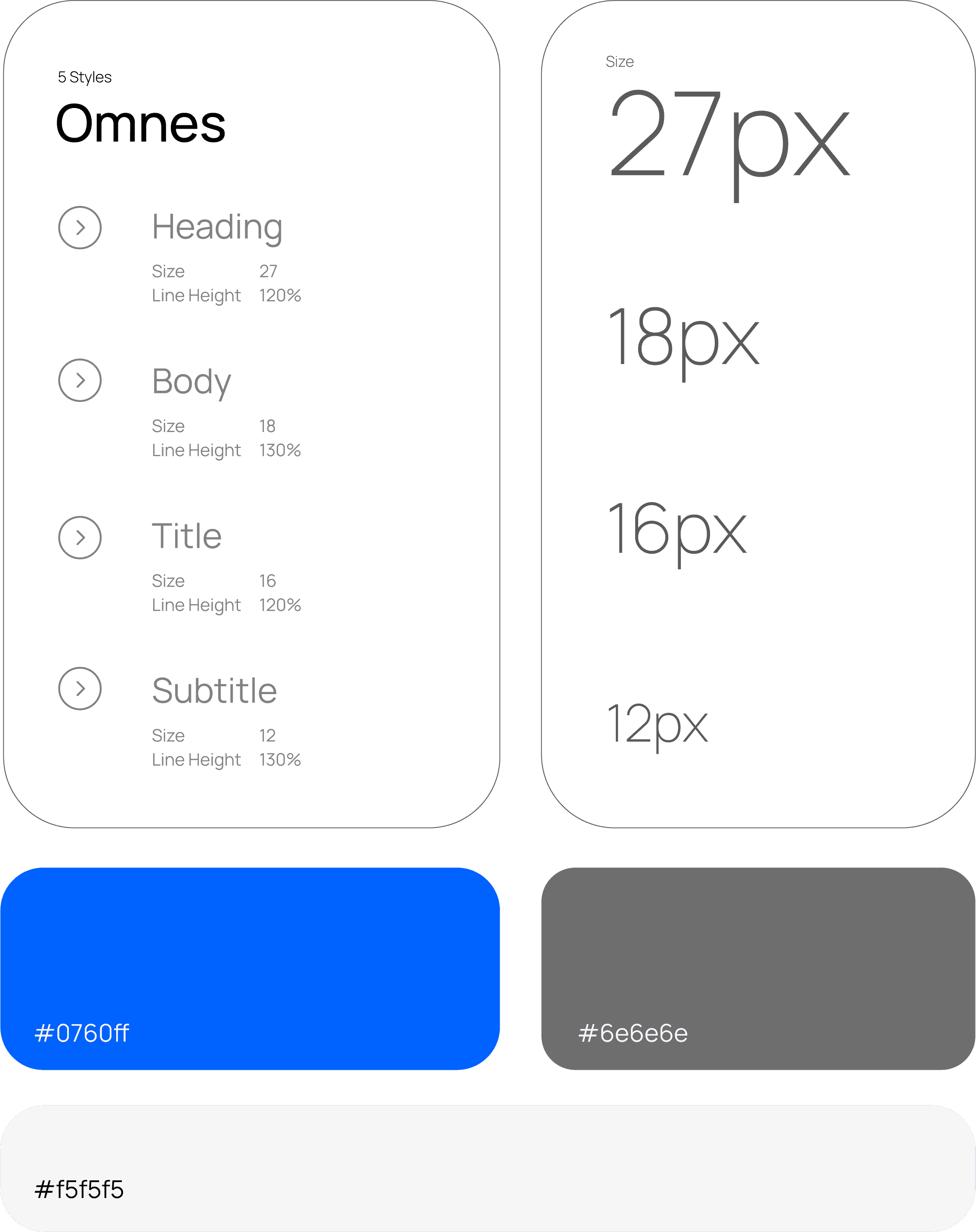
Typography & Color Palette
The typography and color palette in the product design were carefully selected to strike the perfect balance between usability and visual elegance, ensuring an experience that feels both intuitive and aesthetically refined.
Executing over 14 design iterations across 5 agile sprints for the Prints product was instrumental in achieving a refined, user-focused experience. This iterative process allowed continuous user feedback integration, usability testing, and innovation-driven improvements, ensuring the final product was not only polished and intuitive but also strategically aligned with user needs and market expectations.
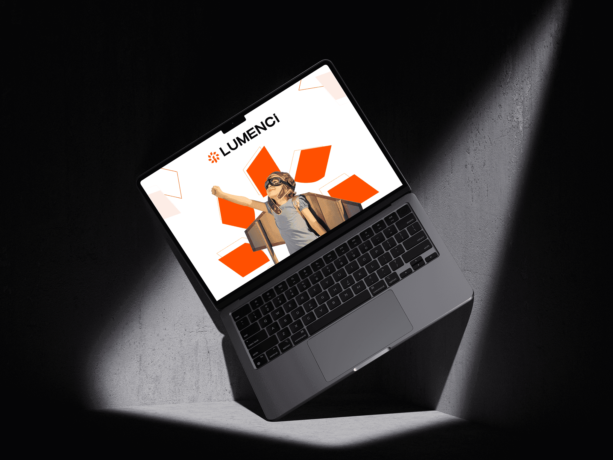
Logo & Branding
Prints establishes a strong brand identity through a distinctive logo and well-defined brand guidelines. The logo, featuring a modern and bold typeface, captures the brand’s contemporary essence and creative energy. Comprehensive brand guidelines ensure consistency in the use of logo, typography, color palette, and tone of voice—maintaining a cohesive and recognizable presence across all communication platforms.
User Flow
The flowchart visualizes the operational workflow of the Engage DSP platform, showcasing its core functionalities and illustrating how each component interacts to deliver a seamless, data-driven campaign management experience.
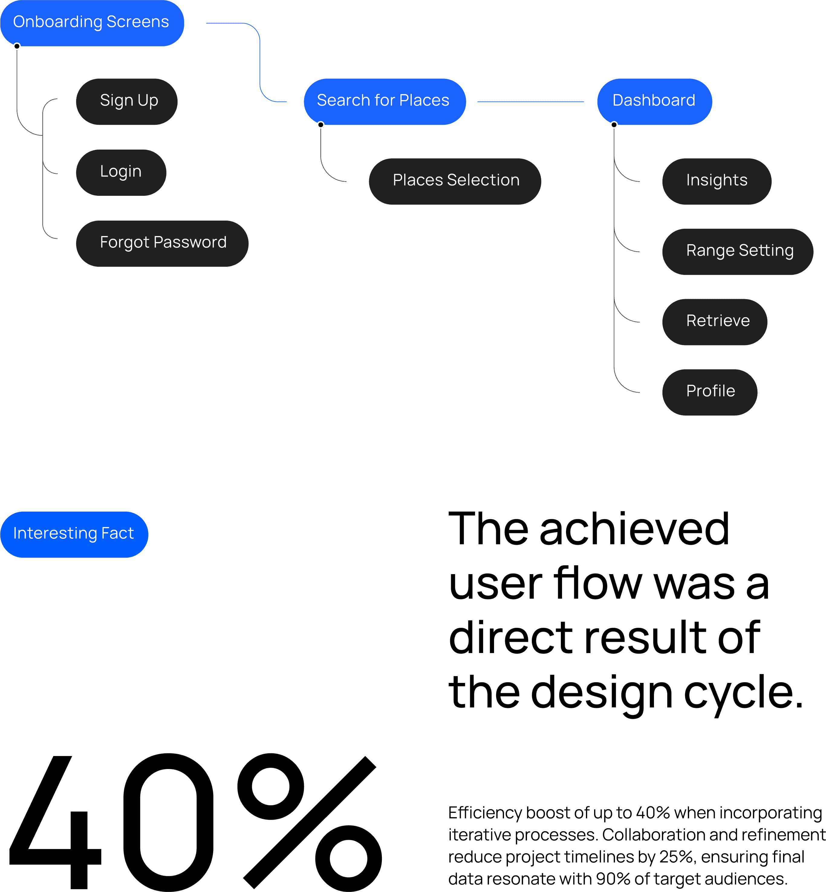
In Prints, the user flow plays a pivotal role in shaping a seamless and intuitive experience. By thoughtfully mapping each step of the user journey—from entry to task completion—the design minimizes friction, enhances engagement, and promotes clarity. This strategic approach not only improves usability and satisfaction but also strengthens user retention and drives meaningful actions, contributing to the platform’s overall success.
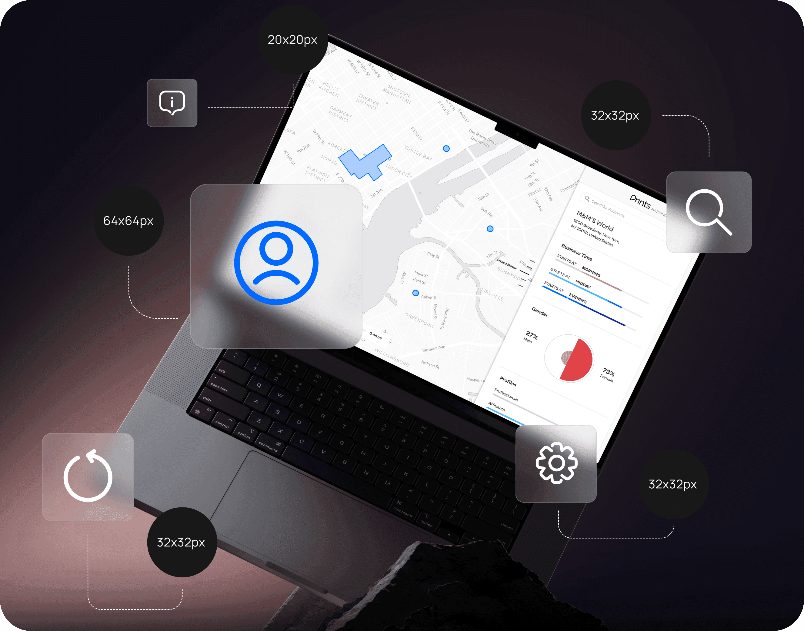
Mapbox Integration / Enhancing Dashboard Visuals
The dashboard integrates dynamic, interactive maps that enrich the user experience through engaging and visually intuitive data representation. Leveraging Mapbox’s advanced mapping capabilities, users can effortlessly navigate, analyze, and explore geospatial insights, enabling more informed and effective decision-making.
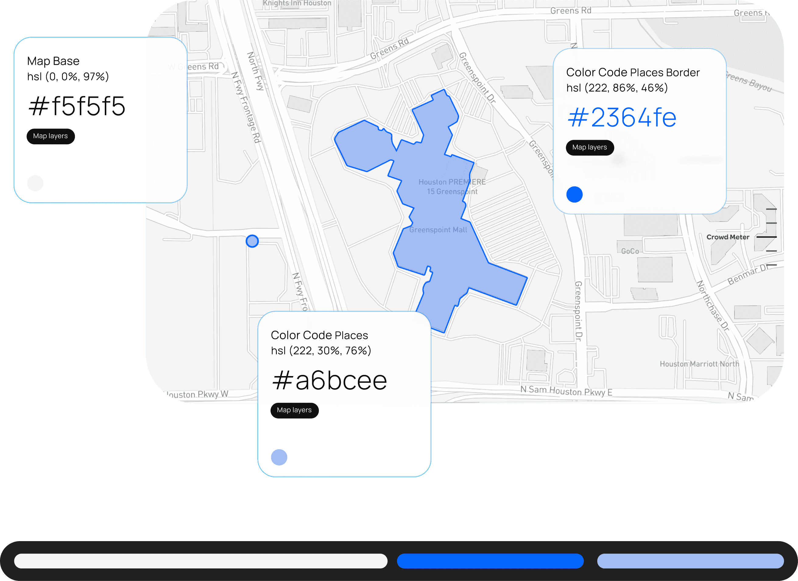
Mapbox empowers Prints with advanced mapping and visualization capabilities, enabling the platform to communicate spatial data with clarity and impact. From displaying points of interest and routes to generating heatmaps and spatial analytics, Mapbox allows Prints to present information in a visually engaging, interactive, and insight-driven format that enhances user understanding and decision-making.
Data Visualizations Graphs and Charts
Daily Footfall tracks traffic patterns to uncover audience movement trends, while Day Parting and Parting by Period provide valuable planning insights for optimal campaign timing. Additionally, Gender, Age Group, and Profile analytics deliver demographic insights that enable precise audience segmentation and campaign personalization.
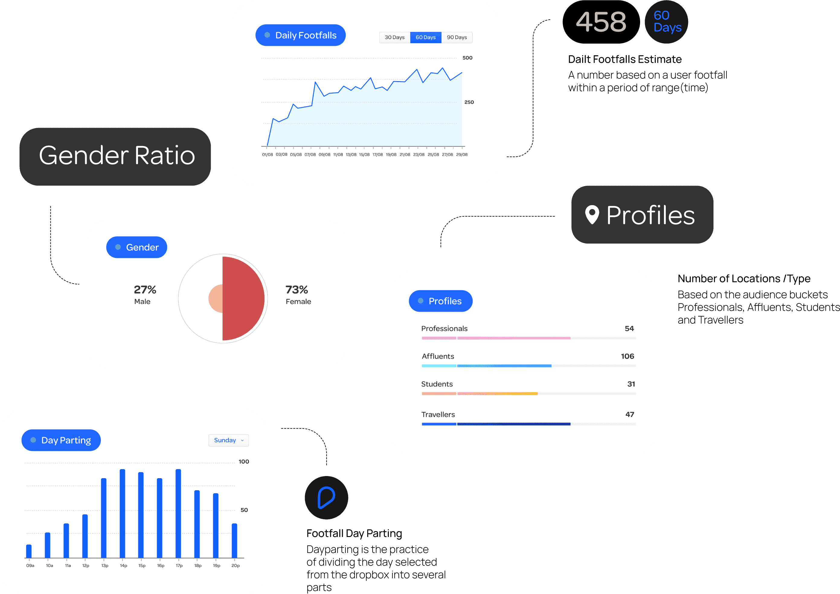
Presenting data through visual formats like graphs and charts makes information more accessible, engaging, and easy to interpret. These visualizations enable stakeholders to quickly spot trends, patterns, and correlations, supporting faster and more informed decision-making. Moreover, they enhance communication and storytelling, transforming complex data into clear, impactful insights that promote effective knowledge sharing across teams.